Best Data Visualization Tools | Comparison & Overview

- Introduction
- What is data visualization?
- Why is data visualization important to research?
- Examples of data visualization
- What are data visualization tools?
- Overview of data visualization tools
- Data visualization in ATLAS.ti
Introduction
Data visualization plays a key role in presenting research findings clearly and accessibly. By converting complex datasets into visual formats, researchers can highlight trends, patterns, and outliers that might be overlooked in traditional data analysis. This article examines data visualization, its importance in research, examples of common visualization types, and an overview of what data visualization tools provide for your research. Understanding these components helps researchers communicate their insights effectively and make informed decisions based on their data analysis or data analytics.
What is data visualization?
Data visualization is the graphical representation of information and data. By using visual elements like charts, graphs, and maps, it provides an accessible way to show how the researchers analyze data to understand trends, patterns, and outliers within datasets. This method simplifies complex data by presenting it in a visual context, allowing for quicker comprehension and analysis.
Data visualization theory can be vast and complicated but, essentially, data visualization transforms numerical or textual information into a visual format. This transformation can range from simple graphs to intricate infographics and interactive dashboards. The goal is to communicate information clearly and efficiently by leveraging visual cues, making it easier for both experts and non-experts to grasp the underlying messages in the data.
Various techniques and tools are employed to create effective data visualizations. Common methods include bar charts, line graphs, and scatter plots, which are suited for comparing quantities, observing trends over time, and identifying relationships between variables, respectively. More advanced visualizations like heat maps and network diagrams are used for representing complex data structures or interactions. The choice of visualization depends on the nature of the data and the specific insights one aims to convey.
Data visualization is a key component of data analysis because it reveals insights that might not be immediately apparent from raw data. It helps in identifying patterns, correlations, and anomalies, enabling researchers and analysts to make informed decisions. By presenting data visually, it also facilitates effective communication of findings to stakeholders who may not have a technical background, bridging the gap between complex data and actionable knowledge.
Why is data visualization important to research?
Data visualization transforms raw data into visual formats that are easier to interpret, enabling researchers to extract meaningful insights and communicate findings effectively. This section discusses key reasons why data visualization is important in research.
Simplifies complex data for better understanding
Research often involves handling large and complex datasets that can be challenging to interpret in their raw form. Data visualization simplifies this complexity by representing data visually, making it more accessible. Visual elements like charts, graphs, and maps allow researchers to grasp the essence of the data quickly. For instance, a complex spreadsheet with thousands of data points can be transformed into a heat map that highlights areas of high and low values. By converting numbers and statistics into visual formats, patterns and relationships become more apparent, facilitating a deeper understanding of the subject matter. This simplification is important for both the researchers analyzing the data and for communicating the findings to others who may not have the same level of expertise.
Reveals patterns, trends, and outliers
Visual representations of data make it easier to identify patterns, trends, and anomalies that might not be evident from raw data alone. For example, a line chart can show trends over time, highlighting increases or decreases in specific variables. Scatter plots can reveal correlations between different factors, indicating positive or negative relationships. Identifying these patterns is instrumental in forming hypotheses, validating theories, and drawing conclusions in research. Detecting outliers is also important, as they can indicate errors in data collection, unique cases, or significant deviations that warrant further investigation. For instance, in medical research, spotting an outlier in patient response could lead to the discovery of a new side effect or a groundbreaking treatment.
Enhances communication and collaboration
Effective communication of research findings is essential, especially when sharing results with stakeholders who may not have a technical background. Data visualization aids in presenting complex information in a way that is understandable to a broader audience. Visual tools help convey the significance of the data succinctly, facilitating better discussions and decision-making. For example, presenting key findings in a bar chart or infographic can make the information more engaging and easier to digest than a table of numbers. Additionally, visualizations can serve as a common reference point for collaborative efforts. Teams can use dashboards and shared visual reports to ensure that all members have access to the same information, enabling them to align their understanding and work more effectively toward shared goals. This collaborative aspect is especially important in interdisciplinary research, where team members may come from different fields with varying levels of data literacy.
Examples of data visualization
Data visualization encompasses a wide range of graphical representations that help interpret data effectively. Different types of visualizations serve various purposes, depending on the nature of the data and the insights sought. This section explores some common examples of data visualization techniques used in research.
Bar charts
Bar charts are used to compare quantities across different categories. They represent data with rectangular bars, where the length or height of each bar corresponds to the value it represents. Bar charts can be oriented vertically or horizontally and are effective for displaying discrete data. For example, a bar chart can show the sales figures for different products in a company, allowing easy comparison between them. Grouped or stacked bar charts can represent multiple datasets simultaneously, facilitating comparative analysis across different variables or time periods. Interactive charts can also help researchers display more detailed data insights when research is disseminated online or at conferences.
Line charts
Line charts display information as a series of data points connected by straight lines. They are ideal for showing trends over time or continuous data. Each point on the chart represents a value at a specific time or category, and connecting these points illustrates the trajectory of the data. Researchers often use line charts to track changes in variables such as temperature readings, stock prices, or population growth over intervals. Multiple lines can be plotted on the same chart to compare different datasets, highlighting correlations or divergences between them.
Histograms
Histograms are specialized bar charts that depict the distribution of numerical data. They group data into bins or intervals, showing how many data points fall into each range. The horizontal axis represents the bins, while the vertical axis indicates the frequency or count of data points within each bin. Histograms are useful for understanding the underlying frequency distribution of data, such as normal distribution, skewness, or the presence of outliers. They are commonly used in statistical analysis to assess the variability and central tendency of datasets.
Pie charts
Pie charts represent data as slices of a circle, where each slice corresponds to a category's proportion of the whole. The size of each slice is proportional to its quantity, allowing for a visual comparison of parts to the whole. Pie charts are effective for displaying percentage or proportional data, such as market share distribution among companies or the composition of a population by demographic segments. However, they are best used when there are a limited number of categories, as too many slices can make the chart difficult to interpret.
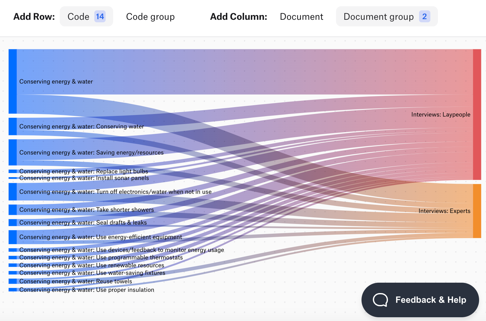
Sankey diagrams
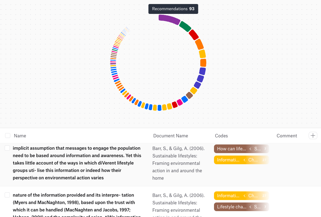
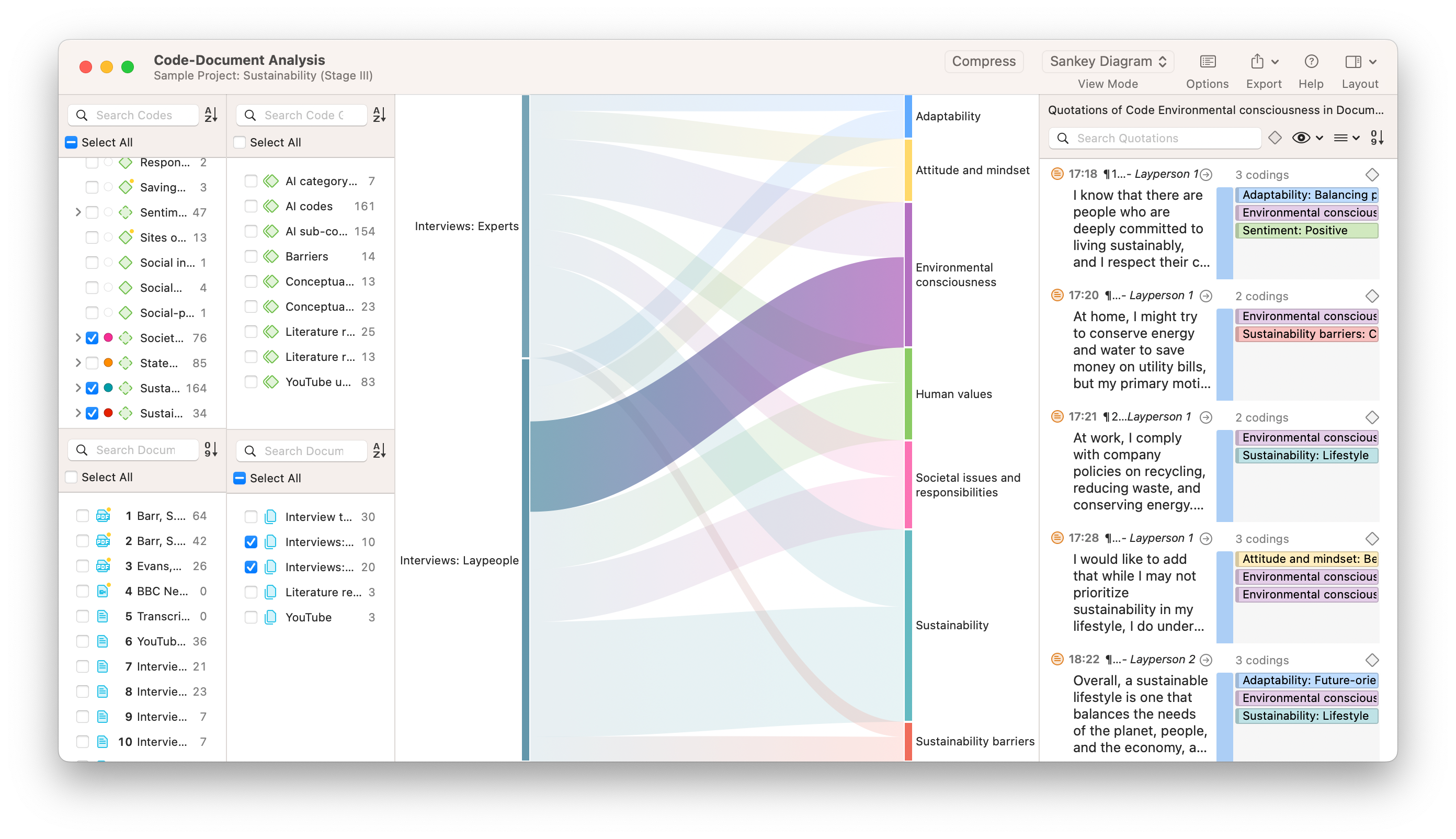
Sankey diagrams illustrate the flow of information from one set of categories to another. They use arrows or paths whose width is proportional to the flow quantity, providing a visual representation of transfers or relationships between entities. Sankey diagrams can be particularly useful for visualizing the flow of qualitative data, such as themes, codes, or categories within your analysis. For example, they can illustrate how specific codes are distributed across different documents or how subcategories contribute to various themes. This visualization helps identify significant patterns and key connections in your data, as well as potential unexpected findings in your analysis process.
Scatter plots
Scatter plots display values for two variables as points on a two-dimensional graph. Each point represents an observation with coordinates corresponding to its values for the two variables. Scatter plots are used to assess the relationship or correlation between variables. Patterns in the distribution of points can indicate positive, negative, or no correlation. For instance, a scatter plot can reveal whether there is a relationship between hours studied and exam scores among students. Trend lines or regression lines can be added to quantify the strength and direction of the relationship.
Mind maps
Mind maps are diagrams used to visually organize information, showing relationships among pieces of a whole. They start with a central concept and branch out to related ideas, creating a hierarchical structure. Mind maps help in brainstorming, planning, and organizing thoughts, making them useful tools in qualitative research. They enable researchers to see connections between concepts, identify key themes, and structure their analysis. Mind maps can be created manually or using software tools, and they are valuable for presenting complex ideas in a clear and accessible format.
What are data visualization tools?
Data visualization tools are software applications that enable users to create graphical representations of data. These tools help transform raw numerical or textual information into visual formats like charts, graphs, and maps, making complex data more accessible and understandable. They are essential for analyzing datasets, identifying patterns, and communicating findings effectively.
These tools offer a range of features catering to different user needs and expertise levels. Basic tools provide simple interfaces for creating standard charts and graphs, suitable for straightforward data analysis. Advanced tools offer more sophisticated capabilities, such as handling large datasets, providing interactive visualizations, and allowing extensive customization. The choice of tool often depends on factors like the complexity of the data, the specific requirements of the project, and the user's technical proficiency.
Data visualization tools typically allow users to import data from various sources, including spreadsheets, databases, and cloud services. They provide functionalities to manipulate data and customize visual outputs, such as selecting different types of charts, adjusting visual styles, and adding labels or annotations. Some tools also support real-time data updates, enabling users to visualize changes as they occur.
Types of data visualization tools
There are several categories of data visualization tools:
- Spreadsheet software: Applications like Microsoft Excel and Google Sheets offer built-in charting tools suitable for basic visualizations. They are widely used due to their accessibility and familiarity among users.
- Business intelligence platforms: Tools such as Tableau, Power BI, and QlikView provide advanced features for data analysis and visualization. They support interactive dashboards, real-time data processing, and can handle complex and large datasets.
- Programming libraries and frameworks: For users with programming skills, libraries like Matplotlib, Seaborn, and ggplot2 in Python or R offer high levels of customization. They are ideal for creating tailored visualizations and integrating them into larger applications or reports.
- Online platforms and cloud-based tools: Services like Google Data Studio and Tableau Online allow users to create, share, and collaborate on visualizations through web browsers. They facilitate teamwork by enabling multiple users to access and edit visualizations simultaneously.
- Specialized tools: Applications designed for specific types of data or industries, such as Gephi for network analysis or ArcGIS for geographical data visualization, offer specialized functionalities that cater to niche requirements.
When selecting a data visualization tool, it's important to consider factors like ease of use, compatibility with data sources, customization options, and scalability. Researchers should choose tools that align with their project goals and technical skills. Other considerations may include data security features, cost, availability of technical support, and the presence of an active user community for troubleshooting and advice.
Overview of data visualization tools
Data visualization software tools help transform raw data into visual representations, making complex information more accessible. This section provides an overview of several popular tools with data visualization capabilities, highlighting their key features and suitability for different users.
Tableau by Salesforce
Tableau is a comprehensive data visualization tool with extensive capabilities. Priced at approximately $70 per user per month, it is ideal for analyzing sales data and other complex datasets. A free version, Tableau Public, is available, but it does not keep data private.
Microsoft Power BI
Microsoft Power BI allows users to visually analyze business data, integrating seamlessly with Microsoft Office applications. It is free for individual users, with costs increasing for additional team members and advanced features.
Gephi
Gephi is an open-source software designed for network analysis and visualization. It processes relational data, such as social media connections on platforms like Twitter. Gephi is also useful for evaluating election data and other complex networks.
Tableau Public
Tableau Public is a free online platform where users can explore, create, and share data visualizations. It offers a gallery of examples and allows users to publish their work publicly.
QlikView
QlikView is a business intelligence tool aimed at enterprise users. Beyond data visualization, it helps uncover unexpected information and data correlations, supporting more informed decision-making.
Datawrapper
Datawrapper is well-suited for newsrooms, offering graphics that adapt perfectly to various devices. The free version may suffice for students or small companies, while the premium version starts at €499 per month. The tool is user-friendly, with most functions being self-explanatory.
Google Charts
Google Charts allows users to import data from SQL databases and create a variety of charts. It is free of charge, but support is limited to community forums.
Plotly
Plotly is a powerful framework for creating interactive, web-based charts. It is known for producing high-quality visualizations and supports a range of programming languages, including Python and JavaScript.
FusionCharts
FusionCharts simplifies the embedding of graphics into web pages and offers extensive formatting options. It is a comprehensive tool suitable for enterprise applications, with associated licensing costs.
RAWGraphs
RAWGraphs positions itself as the "missing link between spreadsheets and data visualization." This open-source tool converts data into vector graphs, processing information in the browser without external storage.
Infogram
Infogram enables users to create infographics, charts, and maps using a variety of templates. Visualizations can be downloaded or embedded into websites. A basic plan is available for free, making it suitable for students, small businesses, and government agencies.
Zoho Analytics
Zoho Analytics is a business intelligence and analytics platform that allows for the creation of reports, dashboards, and data visualizations. Pricing starts at $24 per month for the basic version, with the enterprise edition costing up to $455 per month.
ChartBlocks
ChartBlocks is an online tool that offers different plans for individuals and companies. It requires users to create an account and is designed for simplicity. Charts created can be easily shared on social media platforms.
Chart.js
Chart.js is an open-source JavaScript library for designers and developers. It offers straightforward options and is lightweight, making it suitable for mobile websites. Being open-source, it is free to use.
D3.js
D3.js is an open-source JavaScript library that enables the creation of custom data visualizations. It requires programming knowledge but offers high flexibility and power for those familiar with coding.
Grafana
Grafana is an open-source tool for creating dynamic, real-time dashboards. It is suitable for displaying internal data across various systems, supporting teams in monitoring and analysis tasks.
Highcharts
Highcharts is a JavaScript charting library that enables developers to create interactive charts for web applications. It supports a wide range of chart types and is free for non-commercial use.
Data visualization in ATLAS.ti
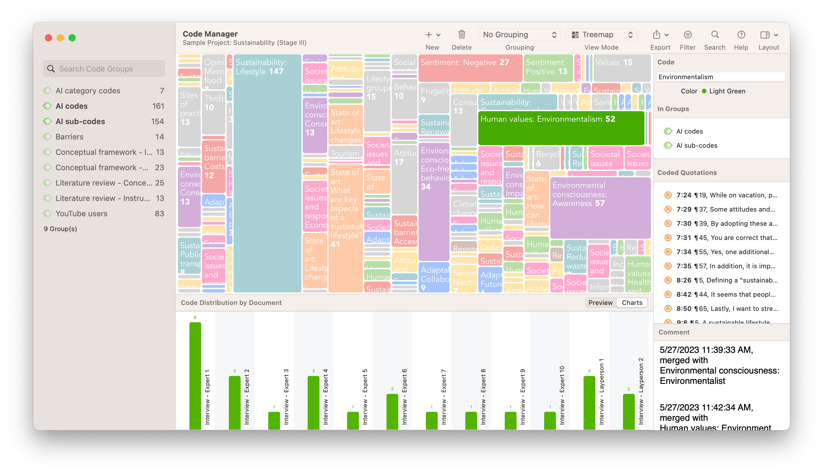
ATLAS.ti is qualitative data analysis software that offers tools for visualizing data to assist researchers in analyzing relationships and presenting findings. Key visualization features in ATLAS.ti include Code Co-Occurrence Analysis, Code-Document Analysis, and Networks.
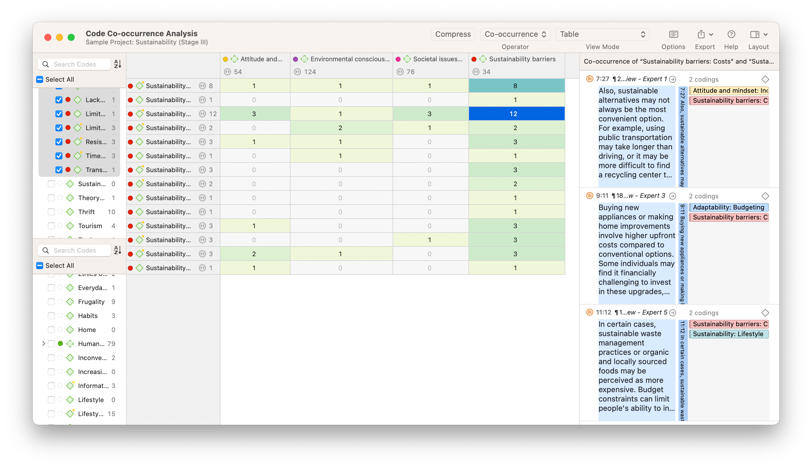
Code Co-Occurrence Analysis
The Code Co-Occurrence Analysis tool displays the frequency with which codes occur together within the data. It presents a matrix where both rows and columns represent codes, and each cell shows how often a pair of codes co-occurs. The results can also be viewed as a force-directed graph, bar chart, and Sankey diagram. These visualizations help identify relationships and patterns between different themes or concepts. By examining the co-occurrence frequencies, researchers can uncover connections between codes that may indicate underlying structures or important associations in the data.
Code-Document Analysis
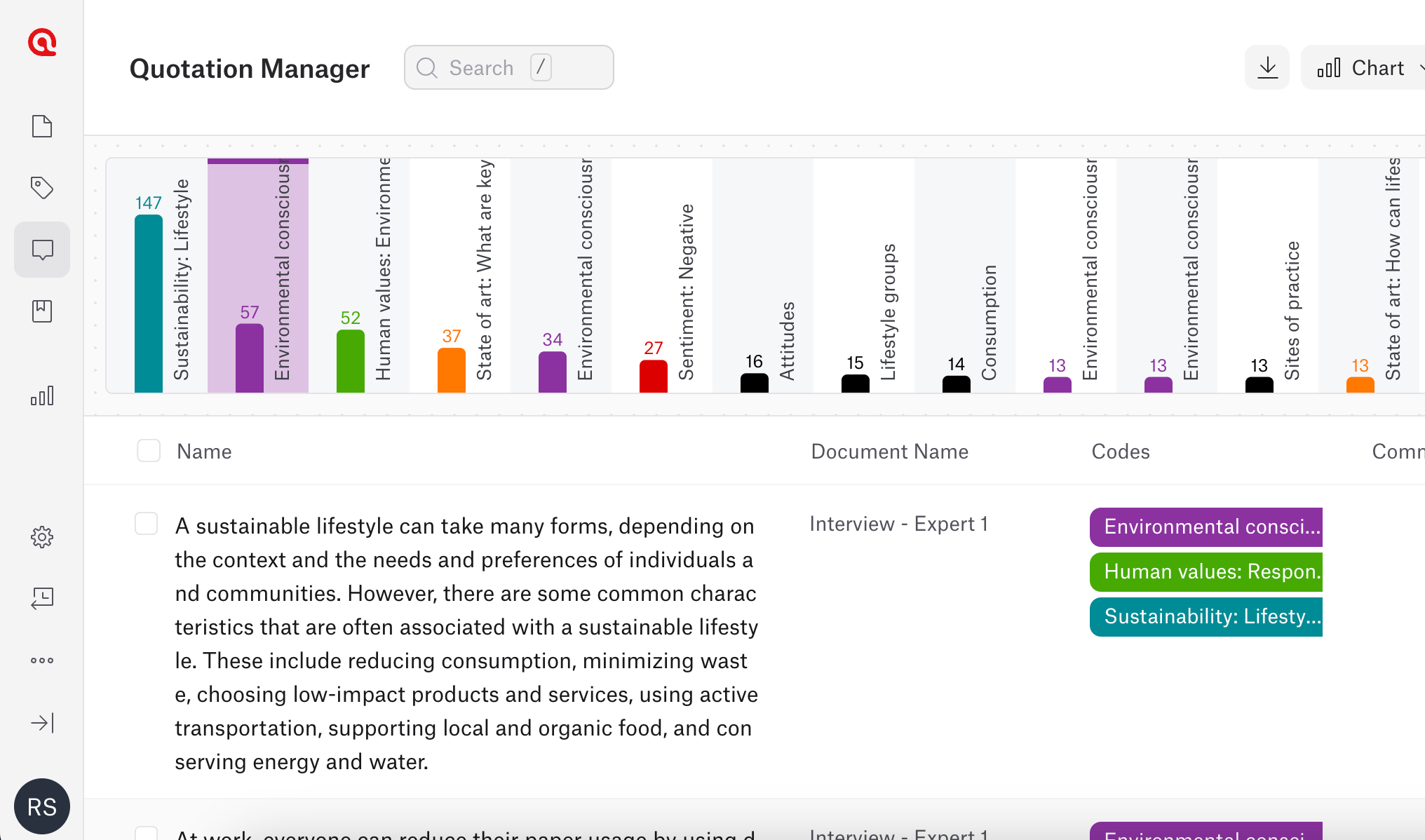
The Code-Document Analysis tool shows how codes are distributed across different documents or cases in the dataset. It features a matrix with codes as rows and documents as columns, displaying the number of times each code appears in each document. This tool assists researchers in understanding the prevalence of themes within specific parts of the data. It allows for comparisons between documents, helping to identify patterns or differences across various sources or participant groups.
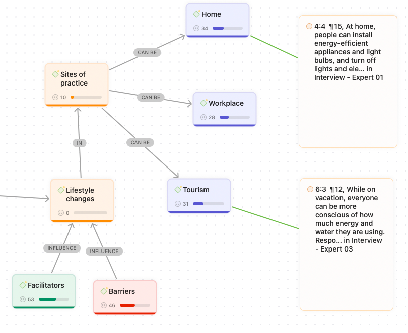
Networks
Networks in ATLAS.ti provide graphical representations of relationships between elements such as codes, quotations, memos, and documents. Users can create visual maps that illustrate how these elements are connected. This feature helps in examining complex relationships and structures within the data. Networks enable researchers to organize and interpret their findings by visually mapping out the connections, which can be especially useful for identifying central themes and organizing the overall analysis.