


- Presenting qualitative data
- Data visualization
- Research paper writing
- Transparency and rigor
- How to publish a research paper
- How to cite "The Ultimate Guide to Qualitative Research - Part 3"
Data visualization - What is it and why is it important?
How often do you read a research article and skip straight to the tables and figures? That's because data visualizations have the power to make large and complex research projects with thousands of data points comprehensible when authors present data to research audiences. Researchers create visual representations to help summarize data and make clear the pathways for actionable insights.

Let's take a look at the process researchers employ to create data visualizations and how ATLAS.ti can assist you with providing a visual representation of your research.
Data visualizations
In everyday situations, a picture is always worth a thousand words. Illustrations, figures, and charts convey messages that words alone cannot. In research, data visualization can help explain scientific knowledge, evidence for data insights, and key performance indicators in an orderly manner based on data that is otherwise unstructured.
For all of the various data formats available to researchers, a significant portion of qualitative and social science research is still text-based. Essays, reports, and research articles still rely on writing practices aimed at repackaging research in prose form. This can create the impression that simply writing more will persuade research audiences. However, framing research in visual ways that are easy for your target readers to understand makes it easier for your research to become published in peer-reviewed scholarly journals or find engagement at scholarly conferences. Even in market or professional settings, data visualization is essential when you need to communicate to others the insights of your research and the recommendations you make based on the data.
Data visualization is important because it makes it easy for your research audience to understand your findings. Also, data visualization helps you organize your data more efficiently. As the explanation of ATLAS.ti's tools will illustrate later on, data visualization might point you to research inquiries that you might not even be aware of, helping you get the most out of your data.
Research employs numerous visualizations to help researchers explain their data, including:
- tables
- line charts
- bar charts
- pie charts
- scatter plots
- pictographs
- word clouds
- heat maps
Whatever the data visualization, a good visualization succinctly conveys the main points of the research findings while also illustrating the data points in such detail to allow research audiences to understand the data and the analysis. Ultimately, the task of visualizing data is unavoidable in data analytics contexts because visualizations can make characteristics or patterns in the data visible that would have been missed in text-based approaches. Even in social sciences and other scholarly disciplines, publishing a research manuscript depends on explaining to reviewers how you collect, analyze, and synthesize data, making data visualization important.
From raw data to data visualization
Strictly speaking, the primary role of data visualization is to make the analysis of your data, if not the data itself, clear. Especially in social science research, data visualization makes it easy to see how data scientists collect and analyze data.
Think about a minute-by-minute description of a soccer match, for example. The sequence of events describing one play after another, who has the ball, who passes it to whom, who scores a goal, and how they scored it make up the raw data to be analyzed. Pundits analyze the data by generating statistics such as goals, assists, key passes, possession ratios, and goalkeeper saves. These statistics are visualized in all sorts of ways in box scores and player profiles, which help fans understand the aspects of a particular game or player and make determinations about the quality of the game they are watching.

In the above example, the visualizations depend on the statistical analyses that pull the relevant information from the raw data. As a result, to rigorously visualize data, you need to have a well-intentioned strategy for analyzing raw data. In other words, how do you look at the data? What are you looking for when you examine your data?
The decisions you make to collect and analyze data will inform your data visualization. For example, if you are conducting market research on customer satisfaction of a product, you might think about the following questions:
- How do you identify customer satisfaction?
- What is the definition of a "satisfied" customer?
- What data should you look at to interpret customer satisfaction?
Perhaps you might interview customers and listen to what positive and negative keywords they use to talk about a product. As a result, a word cloud might be the most appropriate data visualization for that analysis. Whatever analysis you pursue, choosing the best data visualization for your research is an important decision to make.
Data visualization software
Of course, data scientists with a comprehensive understanding of their data can manually produce meaningful data visualization in platforms like Microsoft Excel and Google Drawings. However, it is the organization and coding of research that are essential to visualizing your data, which is where ATLAS.ti can help. As intuitive as the best data visualization tool might be, the preparation of collected data is essential to make the analysis and visualization processes easier and quicker, both for you and other users.
Organizing data
To facilitate the use of data visualization techniques, it is important to consider how the data in your research project should be organized. A market survey might produce hundreds or thousands of response records, so you might want to separate the responses of satisfied customers from the responses of unsatisfied customers to analyze the differences. Likewise, if you are conducting an interview study, you might benefit from separating documents by interview respondent characteristics.
However, what if you have conducted multiple interviews with respondents? Document groups in ATLAS.ti can help you categorize documents that share a common characteristic. Document groups provide a convenient unit of analysis for many of the analysis tools in ATLAS.ti. You can think of a document group like a folder that holds a set of individual documents.
Unlike physical documents in file folders, documents in ATLAS.ti can be assigned to multiple groups which can prove useful for later data visualization. In the example of the interview study, documents representing individual interviews can be categorized into multiple groups along lines of gender, age group, ethnicity, or customer satisfaction. In conjunction with coding and data visualization tools in ATLAS.ti, document groups can help you create useful visualizations comparing broader sets of data. Instead of comparing individual interview respondents, for example, you can compare customer satisfaction across different age groups or ethnicities.
Coding data
Data visualization is effective in explaining research to others only if the researcher or data scientist can make sense of the data in front of them. Research with unstructured and non-numerical (in other words, qualitative) data calls for coding the data with short, descriptive codes that can be analyzed later.

These codes form the basic data points of a meaningful qualitative analysis. They represent the structure of qualitative data sets, without which a rigorous visualization cannot be generated. In most respects, data visualization of a qualitative research project requires coding the entire data set so that the codes adequately represent the collected data.
Data visualization of big data
Big data, however, poses a significant challenge for this process, especially when the enormous amount of work involved with analyzing big data makes a manual coding process leading up to data visualization all but infeasible. As a result, data science has developed artificial intelligence and machine learning to analyze and predict the meaning of complex data.
ATLAS.ti has a number of AI tools that assist with the coding process so that you can create visualizations of big data, business data, or simply data from projects of any size or scale. By applying machine learning to big data, ATLAS.ti can automatically suggest codes for your data, saving time when working on large projects and making smaller projects easier when you are looking for useful insights or new avenues to analyze data.
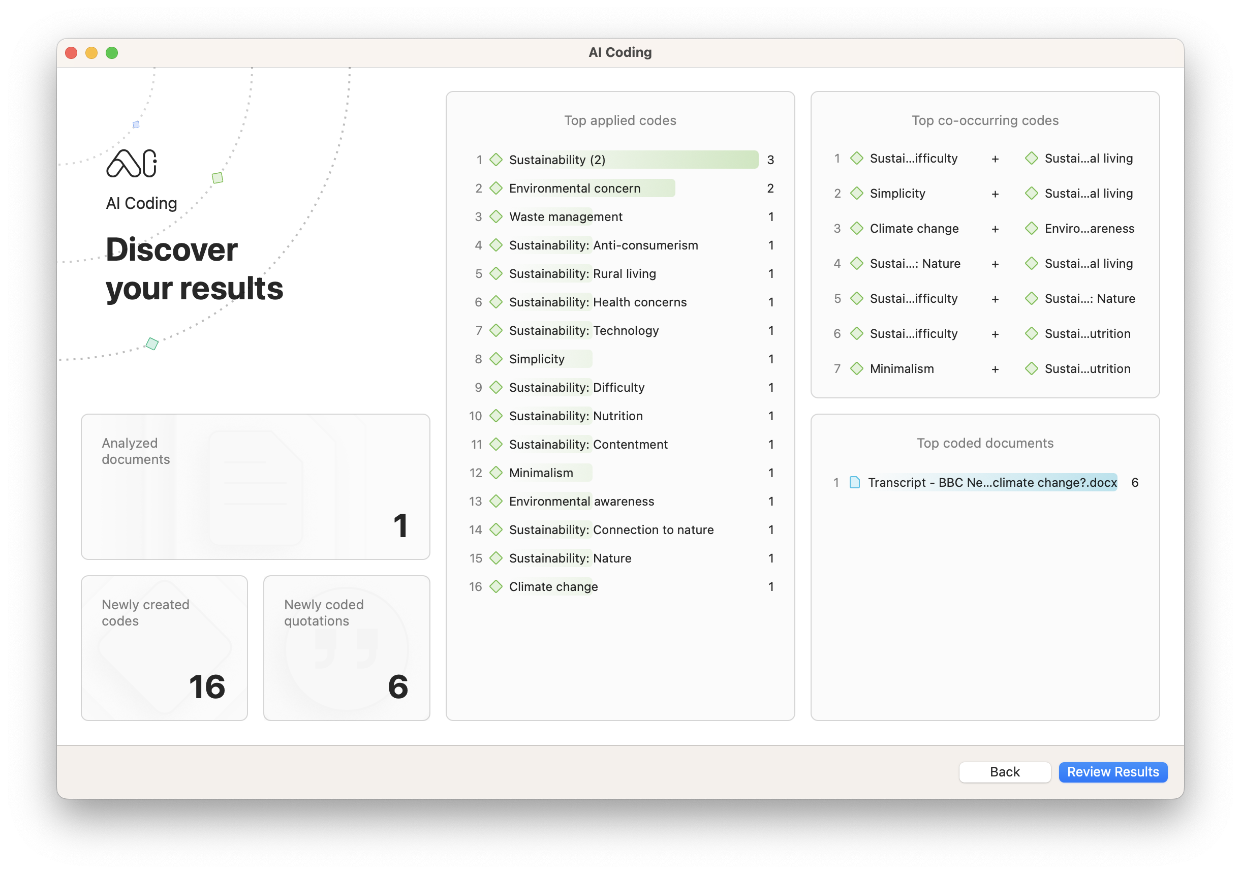
AI Coding automatically gives you a report on the codes it most frequently applies to your data, as well as which codes co-occur together most often. This is a useful tool for data visualization of concepts that artificial intelligence detects in your research project.
Named Entity Recognition
AI can distinguish proper nouns (e.g., New York, Oxford University) from common nouns (e.g., tree, book), which is a useful capability when you are conducting research on brands, companies, institutions, or groups of people. ATLAS.ti packages this AI capability in its Named Entity Recognition tool to make it easier to apply codes to proper names.
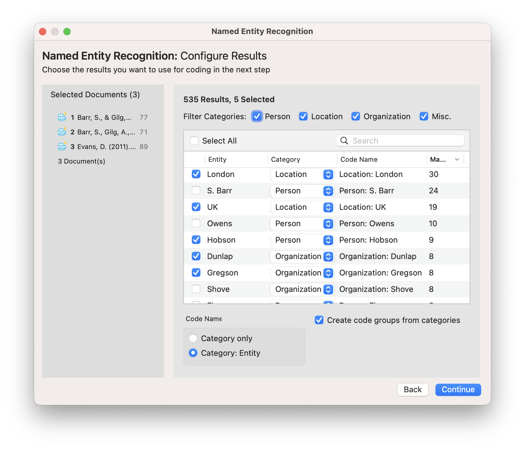
Suppose that you are conducting interviews for market research where respondents are asked about the most common brand names they recognize. If the objective of your research is to determine the most recognizable brands, Named Entity Recognition can examine interview transcripts, identify those brands, and apply corresponding codes to those data segments. You can then look at the frequencies of codes in your project to get a sense of which codes, and thus which brands, are mentioned most often by interview respondents.
ATLAS.ti's data visualization tools
Among the various data visualization tools on the market, ATLAS.ti is an ideal data analytics platform for producing visual representations of qualitative data. Whether you are developing business intelligence or social science theory, ATLAS.ti has multiple data visualization methods to help illustrate the analysis of your research to yourself and your research audience.
Word Frequencies
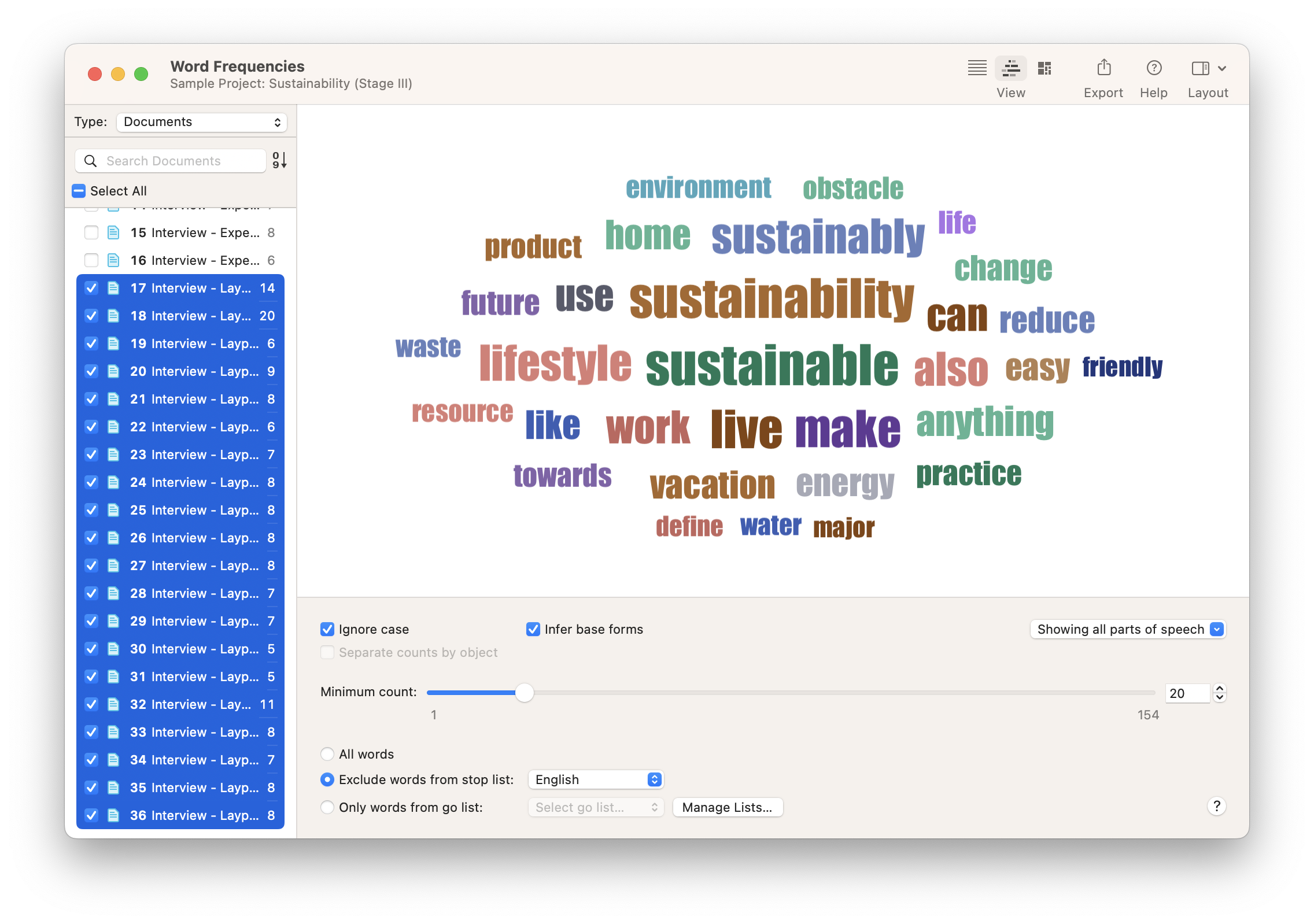
In Word Frequencies, the Word Cloud and TreeMap are useful data visualization tools for showing which words appear more frequently than others. You can narrow the analysis to a set of documents or a set of quotations from a particular code. Then you can even adjust the settings to narrow the word cloud to certain parts of speech (e.g., most frequently used verbs). The resulting word cloud illustrates which words are used most often in your data.
Co-Occurrence Analysis
Co-Occurrence Analysis is a powerful tool to demonstrate the relationship between codes, represented by the number of times they "co-occur" or are applied together in your data. In qualitative research, this co-occurrence is essential to understanding the extent that different social phenomena relate with each other.
For example, suppose that your research inquiry relates to sentiments about brand names. Suppose you have used the Named Entity Recognition to identify brands in conjunction with the Sentiment Analysis or Opinion Mining tools to code for positive and negative sentiments. In that case, you can cross-tabulate codes of brand names with codes of sentiments to determine whether brands co-occur with positive or negative sentiments. Data visualization in the Co-Occurrence Analysis tool can take the form of a simple table, a bar chart, a force-directed graph, or a Sankey diagram. The Sankey diagram is a powerful data visualization that illustrates the strength of a relationship between codes relative to other relationships.
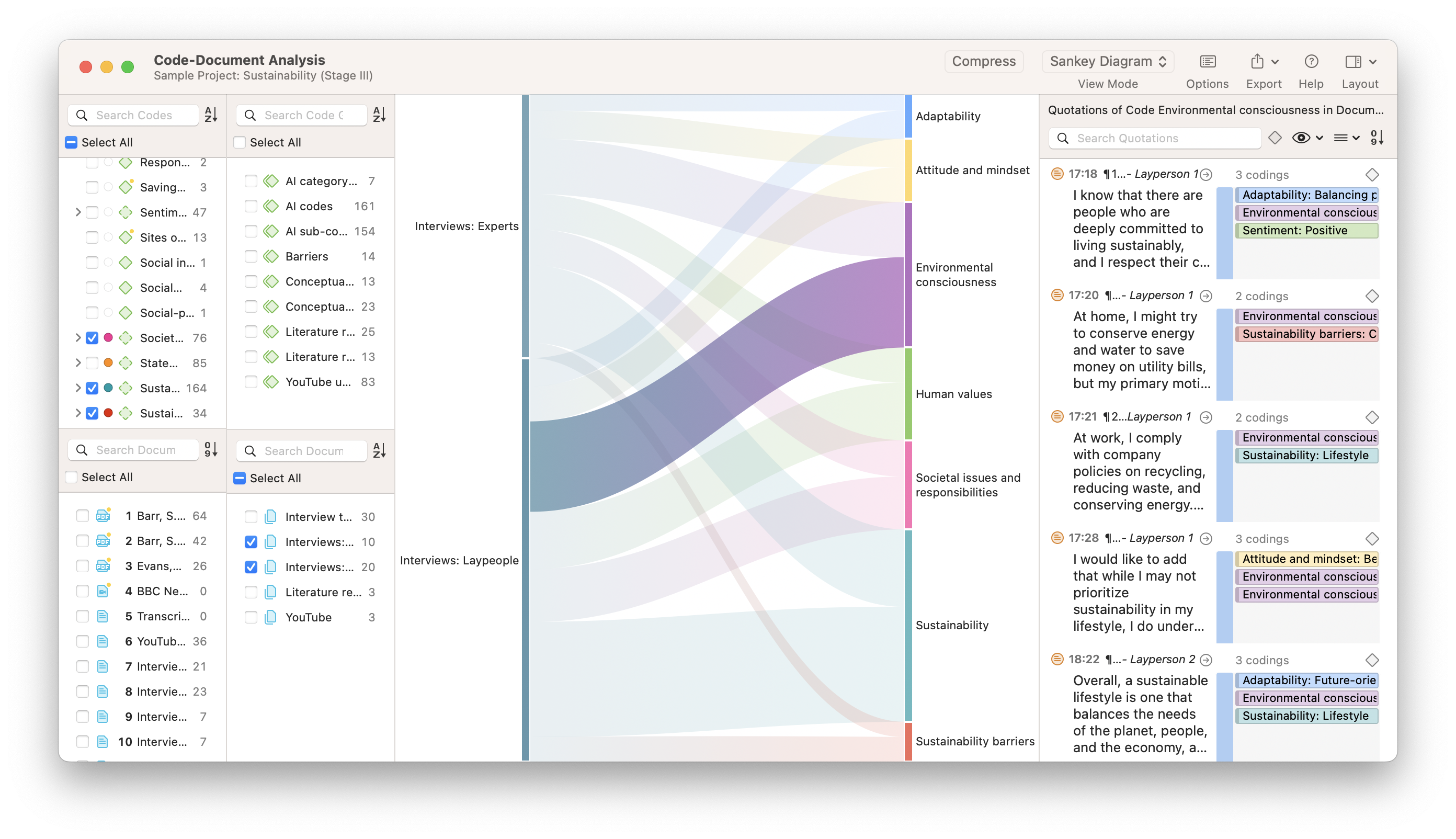
Code-Document Analysis
The Code-Document Analysis tool works in a similar fashion to Co-Occurrence Analysis in that you can perform data visualization through charts, tables, or Sankey diagrams. The Code-Document Table is useful for illustrating relationships between documents (or document groups) and codes (or code groups).
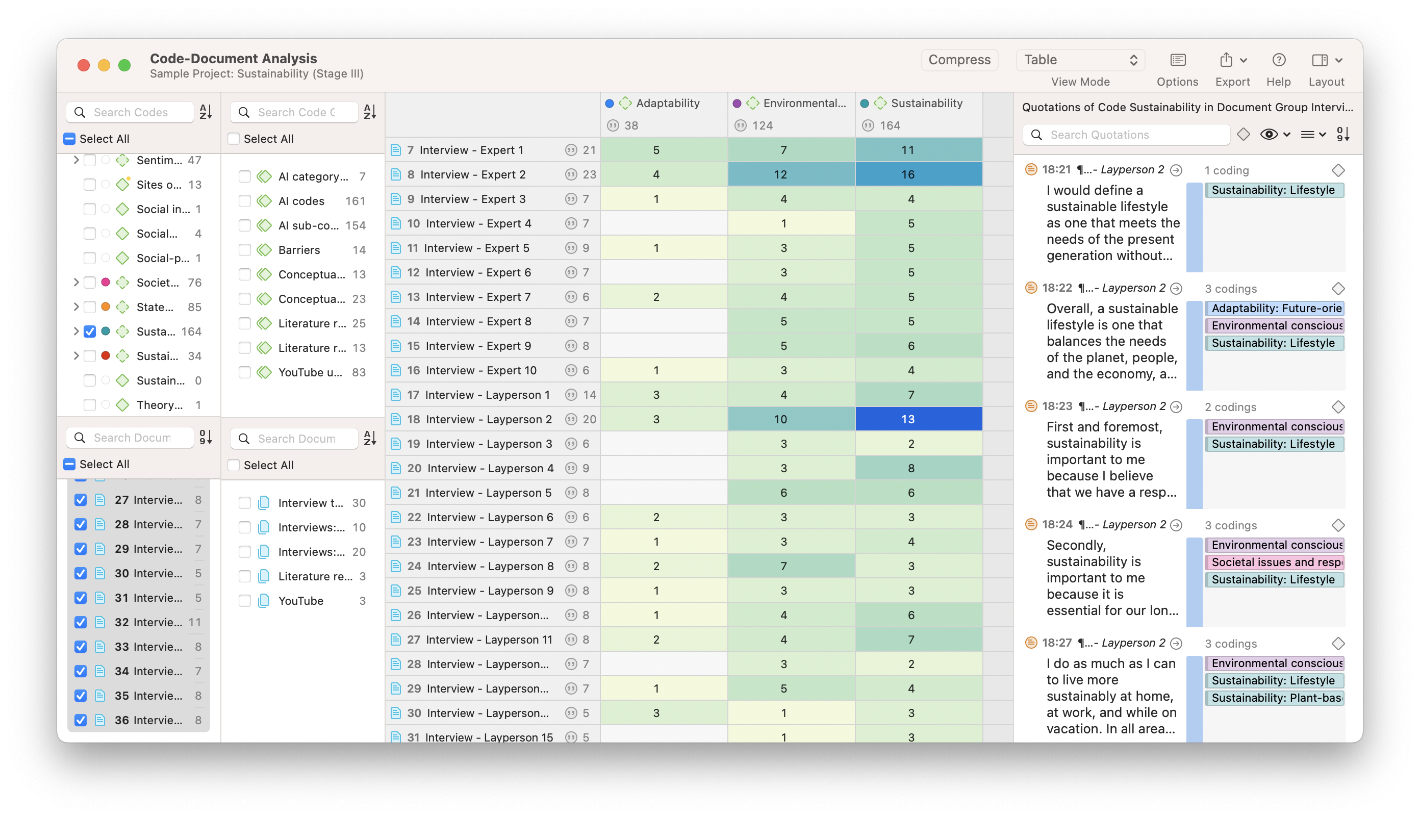
If you have structured your data by documents (e.g., interviews with different respondents, observations by day, etc.), a Code-Document Analysis can give you a sense of which codes are associated with which documents. With this data visualization, you can distinguish between different types of documents (e.g., interview respondents with positive feelings, interview respondents with negative feelings) and narrow your analysis accordingly.
Networks
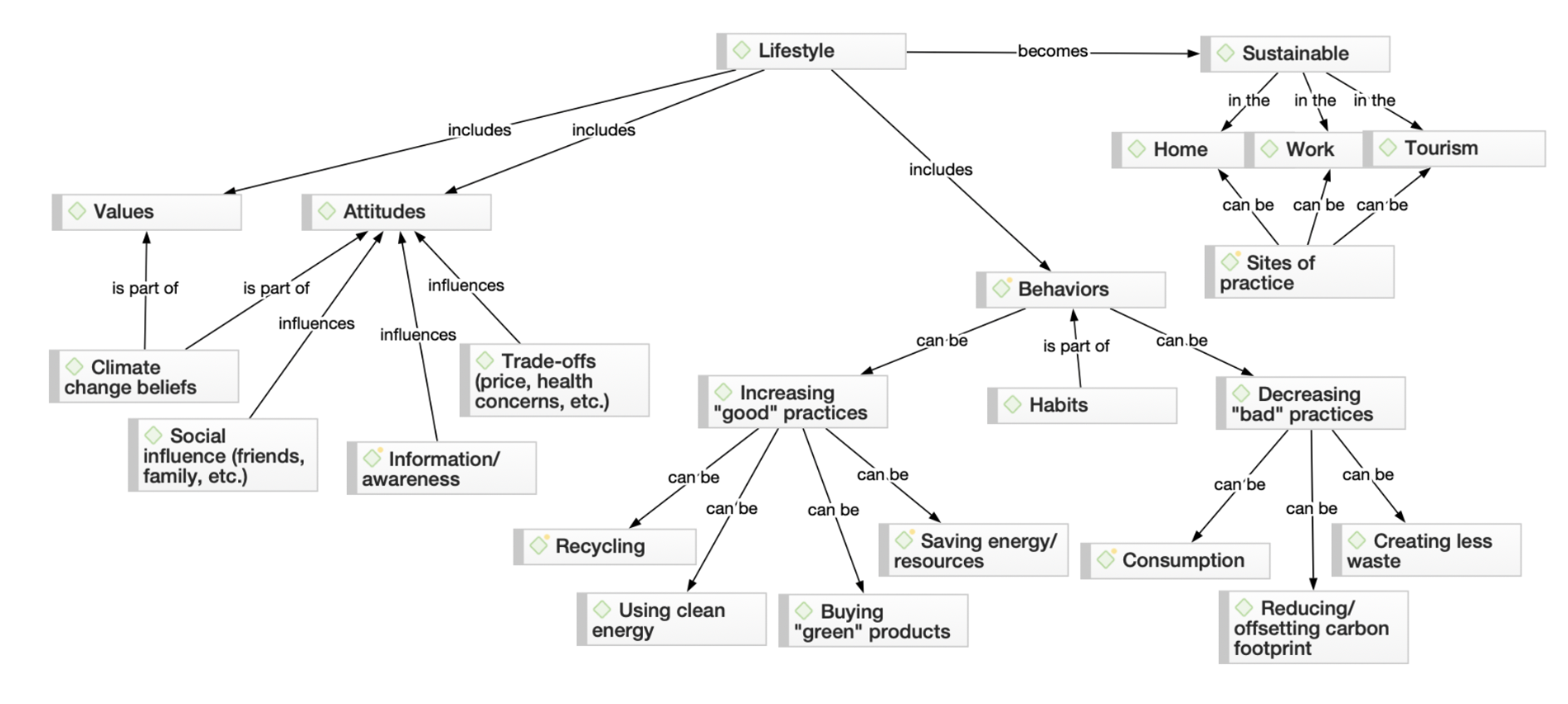
When you need a data visualization that illustrates theories or concepts generated from your data, or just need to organize your analytical thinking visually, you can use the Networks tool to draw connections between your codes. A network is a series of nodes that represent the various elements of your project (e.g., codes, quotations, documents, memos, groups). When visually connected through links, a network can provide a visual sense of the theory or framework that you derive from your research. Otherwise, it can help you flesh out your thinking in visual form to support your analysis.
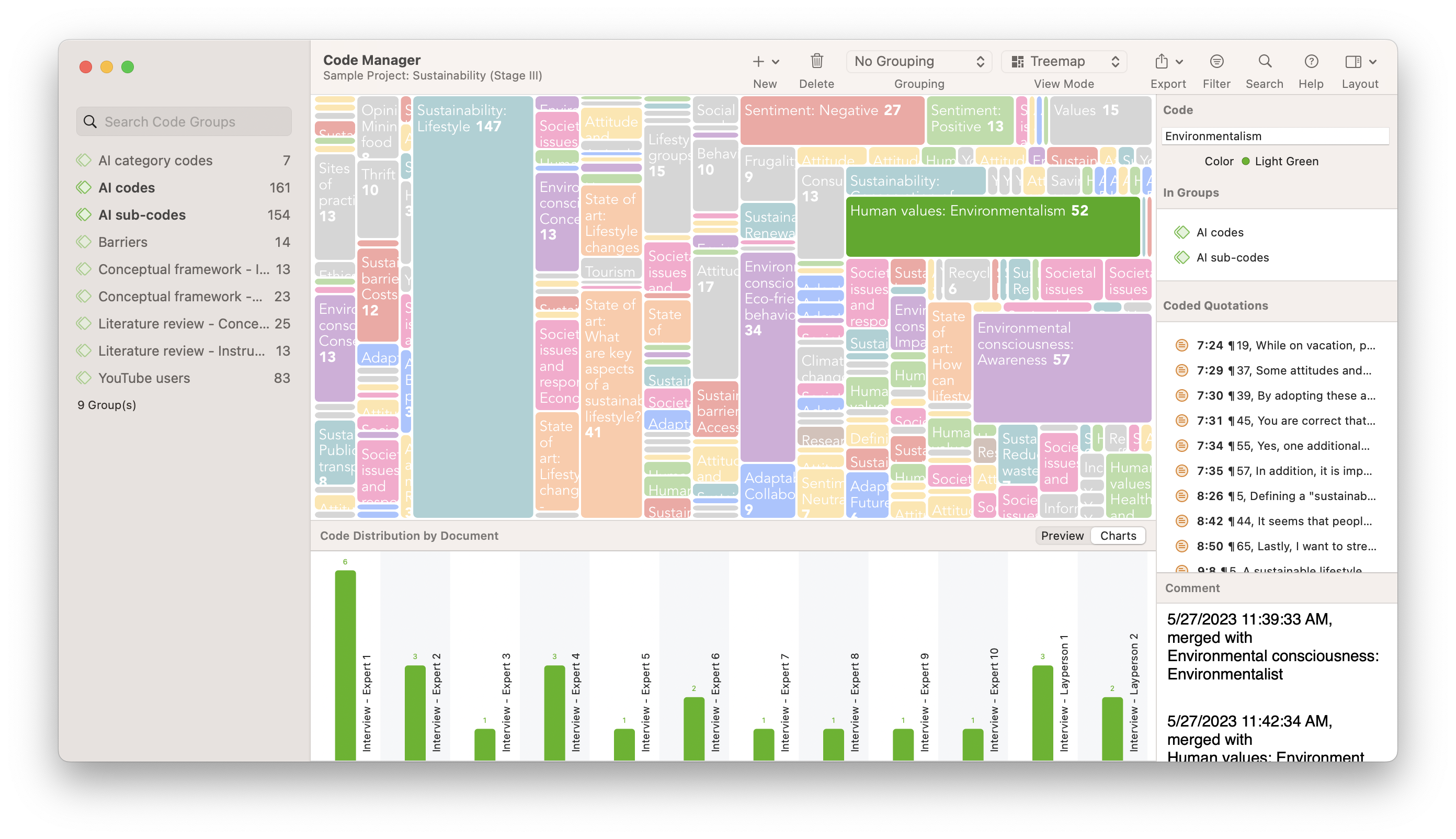
TreeMaps
The TreeMaps tool produces an illustrative data visualization of codes and documents, where the development of each project element is represented by the space it occupies in the TreeMap. Just like with treemaps in the Word Frequency tool, a TreeMap of a project's codes can tell you which codes appear most often in your data. Their prominence in a TreeMap can indicate where potentially meaningful patterns lie, and clicking on any space in a TreeMap will display the relevant quotations in one place to allow for easy analysis of the most meaningful data.
Other visualization tools
At certain points in the data analysis process, a more detailed, graphical representation of your data will require tools outside of ATLAS.ti. Researchers often use a data analysis program such as ATLAS.ti in tandem with programs like Microsoft Excel. You can export data from ATLAS.ti to Microsoft Excel to create data visualizations such as scatter plots, pie charts, and line graphs. More advanced Microsoft Excel users can also create interactive charts, but it all begins with qualitative analysis of data in ATLAS.ti.
Which is the right data visualization tool for your research?
How do you choose the best data visualization tool for your project? As with any analytical tool, the right visualization tool depends on the nature of your research inquiry.
Describing concepts
One main purpose of qualitative research is to describe the aspects of a social phenomenon. What factors do people consider important to defining happiness? What qualities make a good movie? What are the different considerations regarding customer satisfaction?
In ATLAS.ti, data visualization tools provide the capability to illustrate the most frequently used codes in your project. As explained earlier, TreeMaps can help identify qualities or considerations represented by your project's codes and illustrate them to your research audience.
Drawing connections
Alternatively, you can take the most frequently occurring codes and represent and link them in a network to further illustrate correlations and causal relationships within a working theory represented by codes. A visualization of a theory identifies key elements of social phenomena in unordered, raw data as well as the connections between them.
The Co-Occurrence Analysis and Code-Document Analysis tools can create visualizations like bar charts or Sankey diagrams to provide supporting evidence of the connections in your data. Networks are also useful for understanding connections between the elements of your project. Within networks, you can manually establish links between codes if you perceive a relationship between codes that you want to explain to your research audience.